Navionics Puzzle
Sailing from New York City to Cape May, approaching Atlantic City, I found a puzzle in the Navionics navigation application. The time was before dawn, about four o’clock or so. That’s a time when no one is very smart, even if they are rested and well caffeinated.

Forgive me that the screenshots are in Spanish. I’ve written about this in Spanish at Brisa.uy.
My route was through an area marked with artificial reefs.
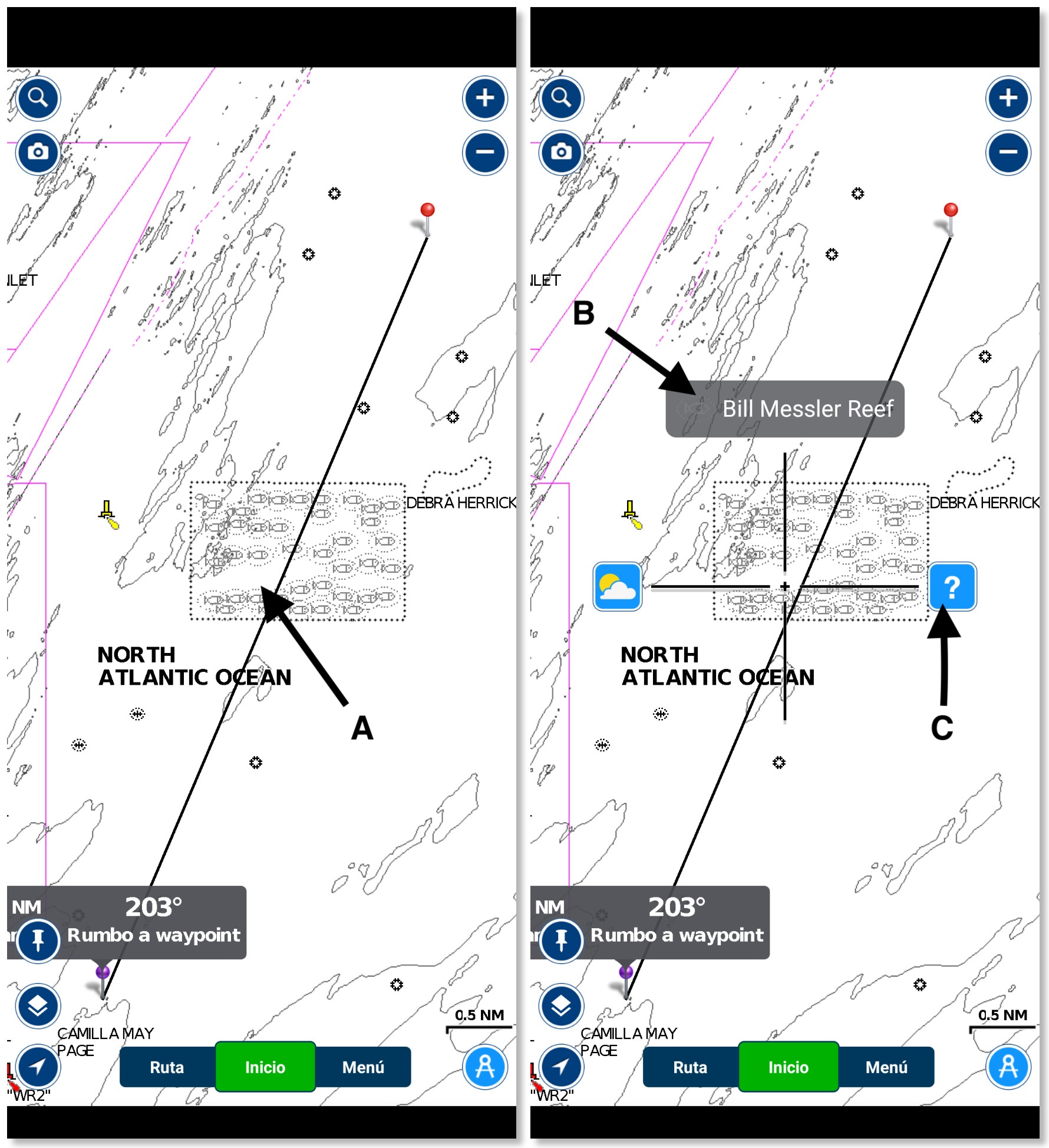
Tapping on an area of interest causes a cross to appear. Find this illustrated with the screenshots of the first photo. In this case, touching point ‘A’ indicated on the left results in the display on the right. It contains a cross with three options. Tapping on point ‘B’, on “Bill Messler Reef” results in the display on the left in the next photo.

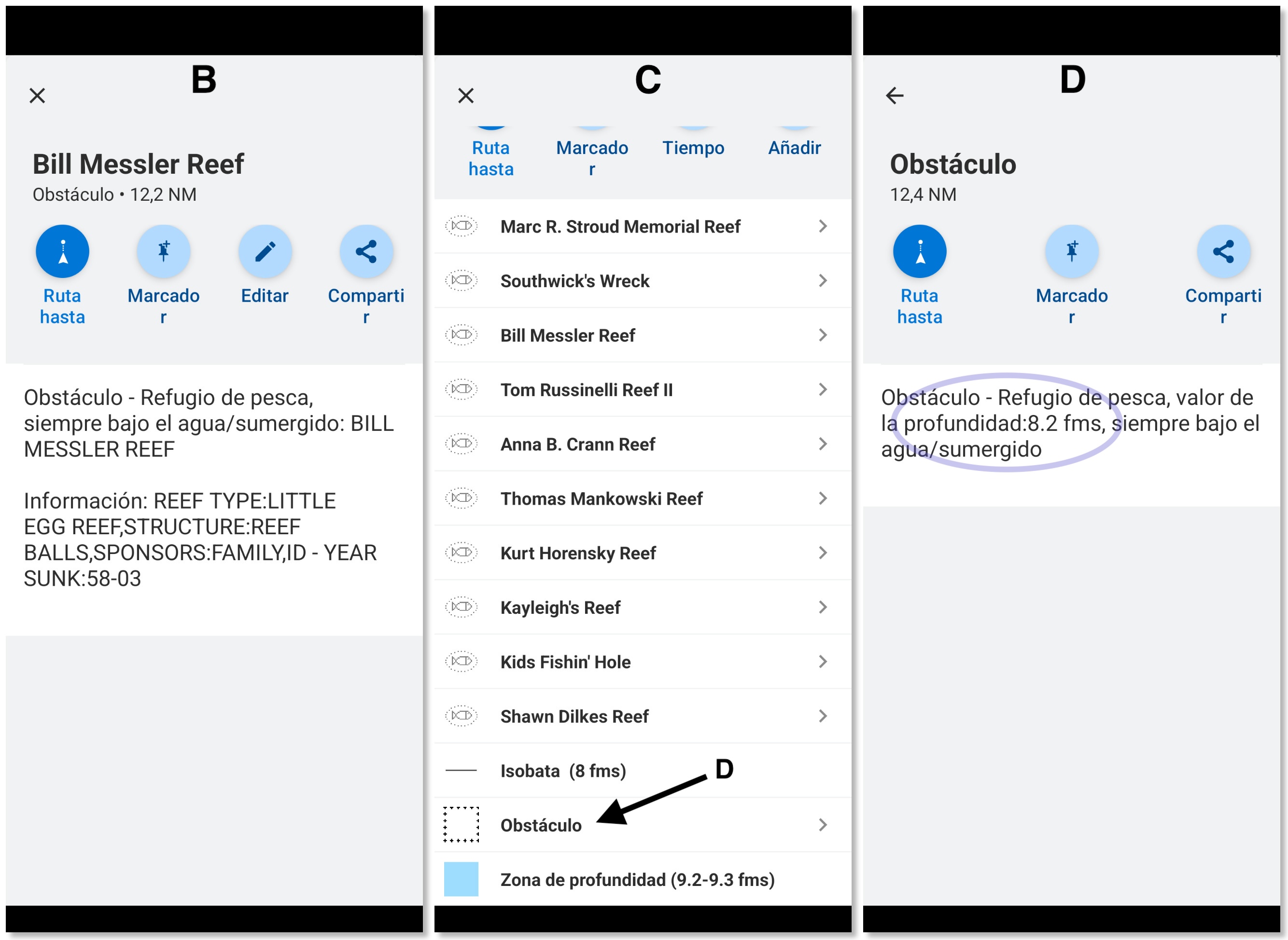
What you can see by touching point ‘B’ is illustrated by panel ‘B’ on the left in the second photo. It is specific information about a portion of the area. It doesn’t tell me anything about what I wanted to know. What I wanted to know was the depth. Is it close with the surface? Should I avoid it?
At the time, I did not remember the method of examining the surrounding area nor did I think about doing so. I thought that I was already seeing information about the dotted rectangle when in fact I was seeing information about one of the little fish that are surrounded by dotted ovals. I looked with dismay at the information presented. It says it is always underwater. “This is terrible!,” I thought, “I’m not going to see it if it’s near the surface.”
I decided to talk to a fishing boat spotted nearby on the AIS. (AIS is the radio system for identifying boats around.) He said he was just driving, that the captain was sleeping. I decided not to ask him to wake up the captain. I decided that, if the captain hadn’t warned the guy to dodge the area and the guy didn’t know anything about it, there was no threat. (Besides, I found on the old printed chart, the one I keep on hand, a sufficient depth).
By day, anchored in Atlantic City and with a few hours of rest, I decided to investigate again. I remembered that touching point ‘C’, the question mark, presents a list of nearby features. Refer to panel ‘C’ at the center of the photo. There is a long list of artificial reefs here. Below them, you see an entry for the surrounding area. You need to scroll down to find it. It is labeled “Obstacle.”
Tapping there, by point ‘D’, produces what you see in the ‘D’ panel to the right of the photo. There I could see that the minimum reef depth is 8.2 fathoms. That is eight times the depth of my hull.
That’s good because, I crossed it!
How I would improve it

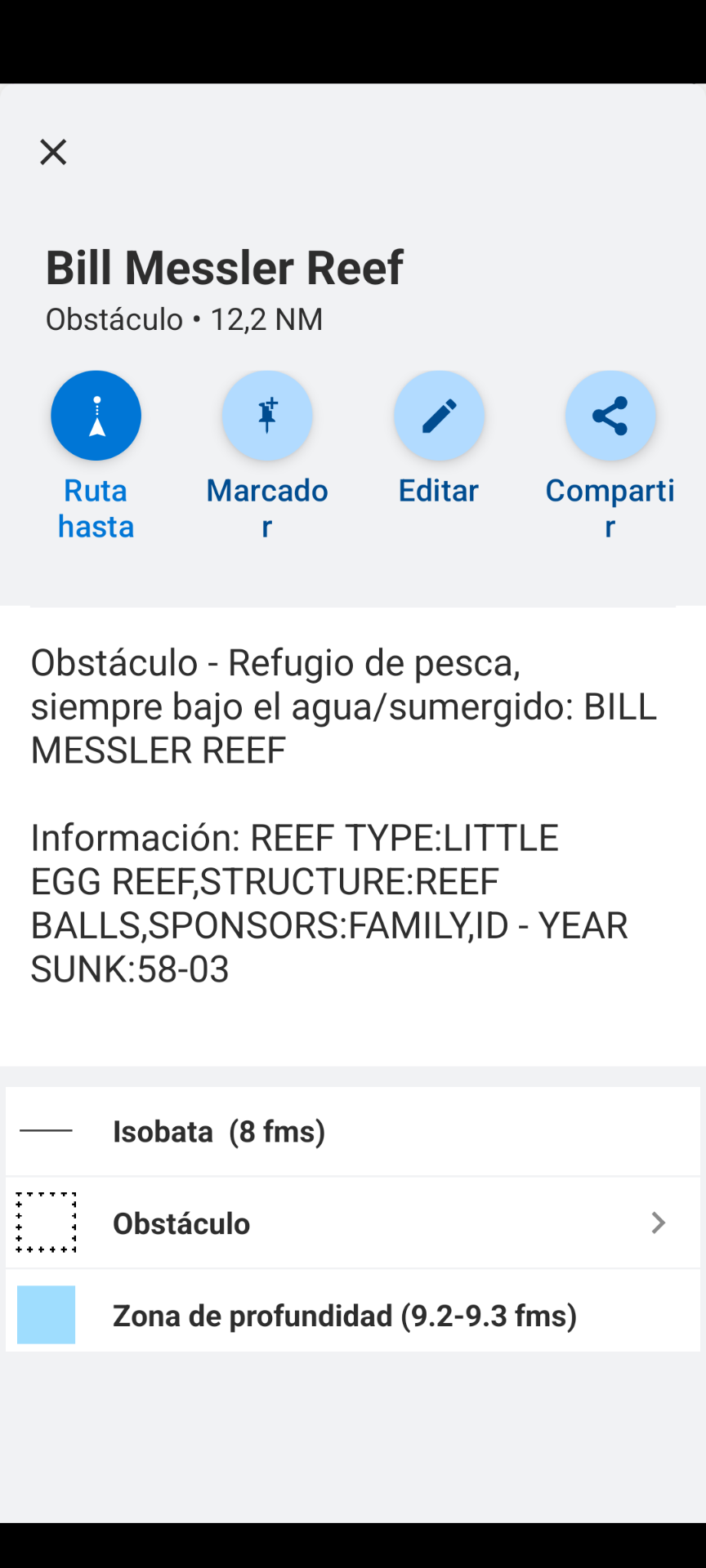
If I had any influence over how this application works, I would show the layered hierarchy for any object poked in the application. I would show the information for the specific object and then a list of things that are beneath it. That is to say, below the information shown in panel ‘B’ I would show the entries seen in panel ‘C’ that are directly underneath the selected point.
With this change, panel ‘B’ would look something like the mockup in the final screenshot.
The advantage here is that I can see straightway that there is information about things underneath. Furthermore I can directly drill down to investigate. As it is I have to:
- Realize that I’m looking at something more specific that what I had hoped to see;
- back-out to the map;
- poke the same place again, and then
- poke the question mark (at the right of the cross) in place of poking the specific place name (at the top of the cross).
It’s possible that the best way to use this app is to always poke the question mark. So often the specific thing at the top of the cross is the thing that is wanted, and then sometimes it is not.