POUI
This is the second in a series of posts about the development of socelect. Here is the first.
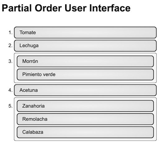
POUI, pronounced “Poe’wee”, is an acronym for “Partial Order User Interface.” The goal of the interface is to make it possible and intuitive to sort a list of alternatives into a partial ordering.
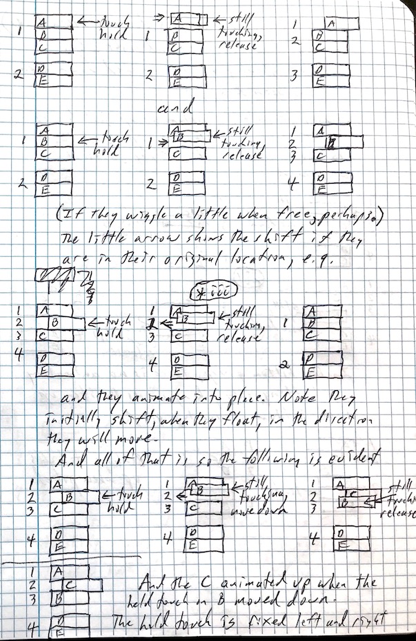
Initial design, sketches

POUI began life as some sketches in a notebook. These evolved through two or three iterations into something I liked.
The sketches represent groups of items ranked equally, not one in the group before another in the group. The position of an item or group determines its preference. Items or groups placed above other items or groups are preferred. The list sorts top to bottom most to least preferred.
I imagined that the first, most natural thing to do is to click the items in order of preference. Click your favorite, then your next, and so forth. To make that happen, the items initially present together in one group, unsorted. Clicking an item in the group moves it up to position immediately before the group. Thus clicking items in order of preference moves them up above the group in order of preference.
In order to show symmetry, clicking the item a second time immediately after clicking it the first time moves the item back down into the group. This creates a predictable behavior when clicking an item.
To preserve this predictable behavior, clicking an item higher up in the order joins it with the item below it into a group, or into the existing group below it. Clicking any item in a group moves it just above the group.
This works well for what I think of as “select in order” behavior. What it lacks is a straightforward facility for reordering. It’s possible, but somewhat of a puzzle, to select items back down into a group and then select them in the new desired order.
To make it simpler to reorder items, I added drag and drop. It’s possible to grab an item and pull it up or down to the space between items or within a group where you desire to have it.
The sketches distinguished groups by staggering items and groups left and right. In the implementation, it evolved pretty quickly to simply surround the groups visually with a box.
Paper prototype
The next step is to do a paper prototype. Paper prototypes are cheap. You can test and learn a lot from them without a lot of effort. In a paper prototype, a person simulates the interface by manipulating pieces of paper according to the rules of the interface. The person trying-out the interface points and gestures to simulate working with pointer and buttons or with a touch screen.
I didn’t do a paper prototype. I didn’t think of it because I was very excited about the sketches and ready to code. In hindsight, it would have been quite simple to run over to the co-working space, beg paper, marker and scissors, and get a whole lot of people to teach me things about my imagined way of sorting items into a partial order.
In reality, it’s never too late. I can also learn by watching people use the current implementation. At the time I imagined instrumenting the interface such that it could record and replay the interaction of anyone who tried it on the web (anonymously and with notice). I imagined presenting exercises with the web site such as, “arrange these alternatives in this order…”, and asking people to try them. Doing that is a lot of work. A paper prototype is simple and effective.
Development

Development started around the second week of March and progressed rapidly. To help others, the project kept a journal with stages. Each stage in the journal told a story about adding additional function. For the most part, the journal documents the choices made, the resources used, architecture, and the strategies. I think its main benefit was to keep me focused and clear.
Choice of tools
There are a number of frameworks for managing the components and interactions that constitute a user interface in a browser. Some of them are Vue, Angular, ReactJS, Ember, Mithril. There are dozens more. I chose the most popular one, but looked at some others first.
ReactJS (React for short) is likely popular because it focuses on rendering and interaction. It treats other concerns such as state management, asynchronous data fetching and updates, data synchronization and such as orthogonal to the problem of rendering the interface and processing the interactions.
React is one of the few things from Facebook that is open and doesn’t track you. Thank you to the billions who use Facebook for free, who have made Facebook so wealthy as to fund development of React without blinking a pixel.
The templating language JSX, used by most with React but not required, is a mix of HTML mark-up and JavaScript fragments. Provided it isn’t abused, provided the JS fragments simply render data and don’t introduce logic, it serves well.
After those there’s Babel. Babel is the true savior of JavaScript. If JavaScript was the masses of the poor, Babel would be Jesus. Babel enables one to write JavaScript in the most modern way, to current standards or to old ones, and translates that into a JavaScript that will work with the most backward of browsers, or the lowest form of browser that you need it to. In the jargon, it’s a “transpiler.”
As you might expect, there are a myriad of plug-ins and configurations of Babel that set it up for the JavaScript that you want to write and the JavaScript you need to produce.
After the framework and Babel, there’s the package manager. The package manager coordinates the processing needed to translate all of the parts you’ve written in various, useful dialects into something a browser can comprehend. It assembles the result into a package or packages for delivery to the browser in such form that shipping and processing run with the efficiency of a credit card transaction.
There are several package managers available– WebPack, Rollup, and Parcel to mention three. Each comes with its own glossary of configurations and controls. I chose the one which had the fewest, Parcel.
There are two major testing frameworks available, Jest and Mocha. After study, I went with Jest. Additionally there are two major libraries available for examining the document model and making assertions about it, DOM Testing Library (DTL) and Enzyme. The biggest difference is in the query methods. DTL queries by visible content, Enzyme by internal structure. I went with Enzyme because I like to make assertions about the structure.
If you find a book, or post, or lecture series about the best way to write JavaScript, and it’s more than two years old, it probably isn’t the best way to write JavaScript anymore. If you find a JavaScript code base that’s more than two years old, it probably isn’t written the way people like to write JavaScript these days.
Test by poking
The interface was developed with a test driven approach:
- write an automated test that fails
- code to pass the test
Having automated tests to know that the interface looks and functions the way we want it to is not the whole story. The key is “looks” and the only way to know that it looks right is to run it and see it. I call this sort of testing test by poking. It’s the method used before test driven development became a practice. This is to say that there’s still a place for it. The key is to use it secondarily to the automated approach.
Drag and drop

The very last function added to the interface was drag and drop reordering. This turned-out to be quite a journey. In other words, it took a lot more time than I thought it would. There were a lot of details to get right, and the journal page for this stage is lengthy.
Along the way I got to explore the Mozilla documentation about the browser model of the page content (the “DOM”) and the events or messages that trigger when you move and click your pointer over parts of the page, or type on the keyboard, etc.
Beyond the standards from the World Wide Web Consortium (W3C), Mozilla has done the most to make useful documentation about how a browser works. They even include information about which browsers support any given feature and whether that support is according to the standard. That is to say thank you to the people at Mozilla and to the people who support them.
It took me six days to implement the basic drag and drop behavior satisfactorily. It was about one third of the effort. The kicker is that it probably isn’t the best or first method I could have implemented for reordering the items. The main reason not is that drag and drop doesn’t work at all with the browser on my mobile device.
Mobile users for a web site likely now outnumber desktop users. It probably depends on the site, and I think I’ve seen numbers somewhere that back that up. The interface has to work with mobile. In a way, I lost six days doing something that was entertaining and interesting, that I thought in my little world was a great idea, that turned-out to be more or less useless.
Hopefully that isn’t true of socelect overall. Or perhaps it is, but that the important thing is that I wanted to do it and now it’s accomplished.
Rank numbers
Technically, the ranking of an item is the number of items that come before it, plus one. The first item, with zero before it, gets rank number one. In this system, given one item ranked first and then a group of three items ranked second, the next item following will have rank five.
If we label the ranked items and groups in that scenario with 1, 2, 5, this is technically correct, but creates a puzzle. What happened to 3 and 4? Instead, the interface uses a numbered list. It gives the group of three that come second a rank number 2, and rank number 3 to the item that follows the group.
Wrapping-up
At the end of March, the interface was functionally complete to the point where I thought it would serve the purpose. It would be three months before I came back around to placing it in a web site and using it; however, this prerequisite part, that I considered a risk, was now proven and ready.
Find the source for the Partial Order User Interface on GitHub as wbreeze/poui. You can toy around with it on its demo page hosted by GitHub.
Follow-up, 2 August, 2019
I did try a paper prototype of a proposed change. I also watched some people use the existing interface. It was enligtening. The existing interface is working for people. The proposed change, not so much.